The Power of Colour Psychology
Colour is everywhere, on screens, in apps, on packaging, and in nature. But beyond being decorative, colour has a quiet power to influence our feelings, decisions, and even behaviour. This is known as colour psychology, the study of how different colours affect human behaviour, mood, and emotions.
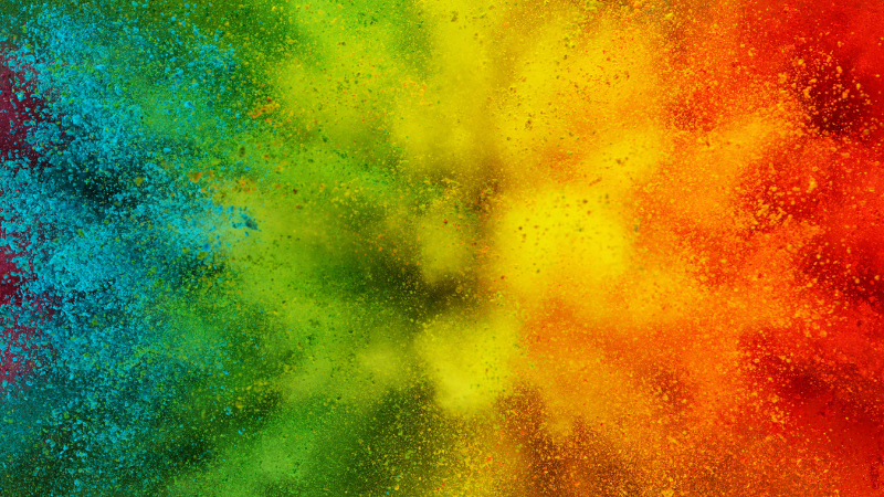
How Colours Shape Perception
Colour can shape how we feel and respond, often without us even noticing. We tend to form quick impressions, and colour plays a part in that. A deep red might feel bold or intense, while a soft blue might come across as cool and calming. These reactions aren’t just based on personal taste or cultural background, there’s a biological side too. Studies suggest red can raise heart rate and even boost appetite, which is one reason it’s popular in food branding. Green, on the other hand, is often connected with nature and a sense of balance.
Of course, people interpret colours in different ways, but here are some of the most common associations that tend to come up:
Red: Energy, passion, urgency
Blue: Trust, calmness, professionalism
Yellow: Optimism, warmth, caution
Green: Health, nature, balance
Purple: Luxury, mystery, creativity
Black: Sophistication, power, formality
White: Cleanliness, elegance, innocence
Colour in Branding
Brands use colour to trigger specific feelings and to establish identity. When you think of brands like Coca-Cola and Ferrari, you probably picture red. That’s no accident. Red suggests excitement and energy, two emotions the brands aim to evoke. In contrast, banks and finance companies like Barclays and PayPal often use the colour blue due to its connotations of trust, stability, and security.
Here are some good examples of companies utilising colour psychology:
McDonald’s uses red and yellow to trigger appetite and a sense of speed or convenience.
Starbucks uses green to align with sustainability and a relaxed cafe vibe.
Apple embraces a clean white and grey aesthetic to promote elegance and innovation.
IKEA uses blue and yellow to balance trust and affordability, creating a friendly, reliable impression that appeals to budget-conscious shoppers.
Applying Colour Psychology to Web Design
Colour plays a subtle but important role in how we experience websites. Designers often use it to help guide attention, create mood, and encourage certain actions, like clicking a button or sticking around a bit longer. But getting it right is all about balance. Too many colours can be distracting, while too few can make the site feel bland or forgettable.
There are a few things designers usually keep in mind when choosing colours for a site:
Contrast: Making sure text is easy to read is a top priority. That often means using light text on dark backgrounds or vice versa. A dark, moody palette might suit a luxury brand, but something like a healthcare site will usually stick with lighter, more approachable tones.
Accent colours: These are used for buttons, links, or anything that needs to stand out. For instance, if a site’s main colour is blue, an orange accent might be used for key actions, since they contrast well and draw the eye.
Tone and mood: Colours can help set the emotional tone of a site. A children’s charity might choose soft pastels to feel welcoming and gentle, while a financial services company might stick to deeper blues and greys to signal reliability and professionalism.
Most importantly, the colour scheme should feel right for the brand and the people it’s trying to reach.
Limitations of Colour Psychology
While colour psychology is a useful tool, it isn’t a magic formula. Personal preferences, cultural differences, and context all influence how colour is perceived. What feels “luxurious” to one person may feel “over the top” to another. This is especially true in global branding, where colours carry different meanings in different regions. In many Asian cultures, especially in East and Southeast Asia, red is considered lucky and good fortune, which is why companies like HSBC and The Bank of China use it in their branding material. In contrast, in parts of South Africa, it’s associated with mourning and sacrifice.
Final Thoughts
Colour might seem like a small detail, but it can have a surprisingly big impact. Whether it’s influencing how we feel, shaping a brand’s identity, or guiding us through a website, colour is doing more work behind the scenes than we often realise. While it’s not an exact science, understanding the basics of colour psychology can help designers and marketers make more thoughtful, intentional choices. In the end, it’s about using colour in a way that supports the message, suits the audience, and feels right for the brand. So, if you’re looking to create a brand or website that not only looks good but feels right to your audience, don’t hesitate to get in touch.
Give us a bell or drop us a line. For website design, digital marketing, web hosting, graphic design for print and SEO, contact us for a chat about how we can help you and your business.