This image has done the rounds and I came across it after it was posted by a 3rd place LinkedIn connection, Cyril Blin De Belin. It could make the perfect caption competition and depending on your business sector it could be used to illustrate a number of things as it’s massively open to interpretation and elicits creative thinking.
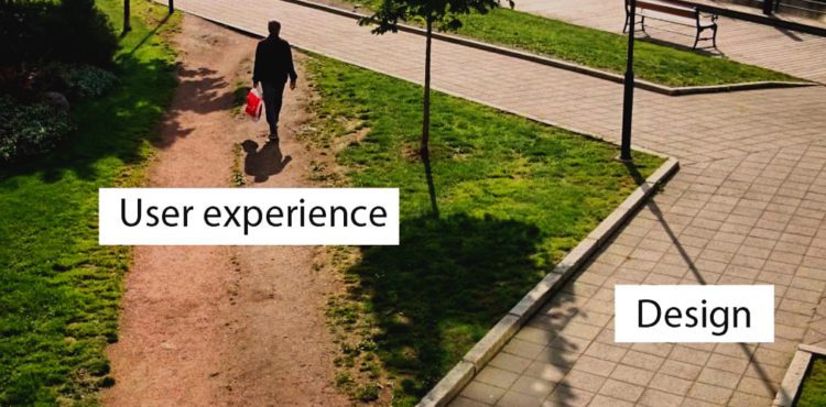
As regards web design, it illustrates that user behaviour is not necessarily occurring in the way that was initially intended: it’s what is known as ‘friction’. Friction is anything that works against a user or prevents them from achieving a goal on a website – ideally, the goal you want them to achieve. In order to maximise conversions and give users an easy, maybe enjoyable, first impression of a company website friction needs to be kept to an absolute minimum: interaction without complication.
Frictionless user experience has now become a standard to any decent web designer. Business websites are primarily designed and built to contribute to generating revenue for companies and friction can be a problem as it results in a high bounce rate (users leaving the site), shopping cart abandonment, simple user boredom or frustration and, ultimately, loss of potential income. So, making the correct website design decisions can hugely improve user experience, encourage engagement and ‘work’ for a business’ bottom line. Here are a few pointers to reduce website usability friction.
This idiom, a tidy house is a tidy mind is worth remembering. What exactly is the website for? What are the success criteria? Having clearly defined outcomes for the website from the beginning will ensure that the website has a purpose, each page has a purpose and the users’ ‘journey’ can be clearly planned. Poorly planned sites are aimless, muddied, unfocussed and, ultimately, confusing for users. If the website has no goal then users will never reach it.
A website should have a consistent feel on each page. Radically different fancy headers and layouts on each page will mean users need to readjust interaction consciously and subconsciously with each click. This creates confusion, then frustration with the interface and results in a messy-looking site. If a website is messy and confusing, what does it say about the company?
Website visitors are looking for information so it should be easy for them to find it. Core services should be easily accessible: if users want something from a company they should be able to find out what solutions it can offer as quickly as possible. Enabling users to access all pages from any other page is a must and burying links to pages they may need in reams of text is a sure way of creating friction – you only have to have used pretty much any government or council website to have experienced this. Remember the frustration?
People are busy and while there’s a perceived notion these days that people won’t read anymore (this is nonsense, incidentally – if what is written is engaging enough, they’ll read it. But that’s another blog) and it’s kind of a self-fulfilling prophecy so a website that takes too much time to use for various reasons is friction. It could be page load time, how much unimaginative written copy there is to trudge through, how long a corporate video lasts or even how long a form takes to fill in.
Even perceived time friction has an effect. If a form looks like it might take ages to fill in or a piece of text looks long and boring or if a checkout facility looks unfamiliar or complicated, the user may not convert to become a customer. Compartmentalising content can help reduce time friction such as forms being split into stages with a progress bar or content split creatively into easily consumable bitesized chunks can help to eliminate this perception.
The idea is to focus (and hold) users’ attention. Anything that distracts attention is friction. There are many things that can cause attention friction like badly written copy, not enough good quality images, too many poorly chose images, gaudy colour schemes and overly fussy and unnecessary transitions or special effects. (Special effects are fine and can be fun but there needs to be a reason for putting them in. Objectives?). Too many elements on a page will compete for the users’ attention and simple is best so as not to over-complicate the conversion process. In reality, the idea is not to grab the users’ attention but to focus it. Video is the website darling at the moment as they can convey the same information as written copy in a quicker and more consumable medium. However, the length has to be right, the script needs to be well-written and the content of the video still needs to be engaging. And, an incorrectly placed video can also hinder the intended path through the site that the user should take.
We’ve mentioned friction caused by unengaging and badly written copy but the choice of buzz words and calls-to-action should be carefully considered. High-friction words often seen on buttons such as buy, submit, support, join and learn more are, at best, uninspiring and could be quite easily replaced with lower friction words. Get it now, check this out, discover, I want this, say hello add more dynamism and creativity to buttons. Button text can have critical effect on conversion ratios: it may be only one or two words but the wrong ones could lose a sale.
The previous six elements highlighted are just a few of the things that can cause friction on a website and cause users to behave in an unintended or unpredictable way; a whole book could be written about it. If you spend just a few minutes looking at a website after reading this article, you will no doubt spot a few things we’ve mentioned here. When a company decides to commission a new site careful consideration should be made to address these causes of friction so here is a quick checklist of things that need to be thought about:
Insist on a wonderful design: People like lovely looking things. Ugly websites are possibly the greatest cause of friction so inappropriate or illegible fonts, poorly placed CTAs, irritating popups, nasty flashing banners, lots of zoomy-in things and cluttered or messy layouts all contribute to a mass exodus of a website. Visitors know when they’ve arrived at a badly designed website – they may not necessarily know why it’s bad but failure to deliver on functional design will create friction.
Make a visit easy: Don’t ask the user to do too much. Ask for only important information on forms, create a fluid logical navigation that doesn’t require too many clicks and eliminate anything that doesn’t serve a purpose in achieving the website’s objectives: ask, What’s it for? If the anwser is nothing, get rid of it.
Reduce options: If there are too many options on a website users will experience choice paralysis. Choice paralysis occurs in Costa and Starbucks which is why there’s always a queue: too many types of coffee, too many ways of having your milk, too many sized mugs, too many ‘helpful’ offers of flapjack, muffins, sandwiches, paninis, etc. Too many options can lead to confusion, time friction and attention friction.
Remember, it’s not your website: It’s your users’ website so when testing, put yourself in the shoes of a customer. Have a click around and imagine you’re someone who is looking for the services you offer. Sometimes it’s hard to emotionally distance yourself from something you’ve worked on for a while so ask associates, work colleagues or employees to test usability and collate opinion.
Businesses whose web designers have nailed the art of eliminating website friction through a combination of great design and thorough planning will create a significant competitive advantage for that company and it can be pivotal in the firm’s success.
So, this image shows that despite the urban planner’s idea of where pedestrians should walk, enough people have figured out that walking along a hypotenuse of a triangle is a lot less faff than going the long way round; there is friction in the design and this is user behaviour in action. What will users of a business’ website do to avoid faff?
Conversely, and looking at the state of the grass, it also shows that cutting corners on a project can really make a mess of things.